Tuesday, March 18, 2014

BREAKING TILES FOR MOSIACS


I often break ceramic/stone tiles with a hammer for a broken tile mosaic projects.  I do this outside and place the tiles on top of a flattened corrugated cardboard box (to avoid any inadvertent damage to the driveway).  An old towel is placed on top to keep the tile pieces from flying around as I hammer and break them.   Despite the towel – pieces could still fly out to the side, and I would have some sweeping up to do when done.  I came up with a solution by accident . . .
 

. . . why not use the old pizza box from the night before to contain the flying fragments?!   Just place your tiles within the open box.  Then place the towel on top of the tiles within the box and hammer away.  The sides keep the tile pieces safely within the box and provides for easier cleanup.


SUPPLIES
Ceramic or Stone Tiles
Hammer
Old Pizza Box
Old Towel (it will tend to get cuts/holes)
Safety Goggles
Extra Cardboard Boxes to store broken tile pieces.

TIP#1 – I highly recommend wearing safety goggles for this process.  Even with the towel over the tiles it’s still possible for pieces to come flying out.  Recently, I purchased a new more comfortable pair from Lowe's for around $8.

TIP#2 - After you break a piece of tile a few times, look under the towel and pullout the small pieces that are the size you want and set them aside (small cardboard boxes work well here).  Continue to break the remaining pieces until they are the size you want.

TIP#3 – Make sure you clean up well after breaking tiles.  Those tiny pieces of broken tiles can be very sharp on bare feet and pet’s paws.
TIP#4 – Your local Habitat for Humanity Restore is a great place to pick up cheap tiles for these types of projects.

TIP #5 - I have used this method for breaking ceramic, travertine and marble tiles.  The only type of tile that I have had trouble with is slate which did not break easily for me.  It broke up in sheets /layers rather than broken pieces ideal for mosaics.

TIP#6 – Building a home or doing a renovation? – have the tile scraps from the installation set aside so you can use them later on mosaic projects.  Here are some projects I did in our home with the leftover ceramic floor tiles…


For all my mosaic posts, see my MOSAICS page.

Thursday, March 13, 2014

BOAT OARS - WINDOW HARDWARE


Boat Oars Window Hardware


OK, so having the boat oars as window hardware in our beach cottage isn't anything all that unique,  I know it has been done before all over the place, but I just love it.  These oars were given to us by a friend who had them sitting in his garage.  They were already a pretty shade of blue, a little bit weathered, and I didn't have to do a darn thing to them.

Boat Oars Window Hardware

Boat Oars Window Hardware

The white brackets were purchased from Lowe's.

Brackets found at Lowe's

The linen sheers were from JCP - a great bargain especially considering we needed extra long sheers with our 10 foot ceilings.  I like that the sheers are light and airy and contribute to the beachy style of the room.

Boat Oars Window Hardware


The width of the oars worked out perfect with our windows.  We let the length of the sheers determine the mounting height of the hardware and this worked out nicely as well. (I was so happy my Mom and I didn't have to do any hemming.)

My plan is to paint this bedroom a pale blue (a similar shade to go with the quilt on the bed).  I'm looking at Mountain Air by Sherwin Williams.  I would also love to make the wall behind the bed a white-washed paneled wall.  Don't tell my husband - he wants me to cool it on the new projects and just enjoy the cottage for awhile ;o)

Boat Oars Window Hardware

We also used boat oars as wall décor in the bonus room.  See the post here.
 
For more beach cottage posts see my Beach Cottage page.

Wednesday, March 12, 2014

END TABLE - CANDLEWAX & VASELINE PAINT DISTRESSED

END TABLE - CANDLEWAX & VASELINE PAINT DISTRESSED
 
I had a lot of fun painting and distressing furniture for our beach cottage, but just writing this post makes my blood pressure go up as I recall how aggravated I was with this particular table.   It wasn't the table's fault - I was feeling brave after playing around with some light distressing on other projects.  I had this vision of heavy distressing and chipped paint effect - and I had no experience with it.   I went through the process of sanding, painting and distressing multiple layers of paint three times before I was happy with the result.

The frustration with this project started when I had such a hard time finding the table to begin with. I knew I wanted a round table, but everything was either too big or too small, too tall or too short, or way too expensive.  After a couple months of searching online, checking Craigslist, going to various stores - at TJMaxx I found a winner!

Despite my frustration - I learned a lot.  I write this post in hope that others may learn from my mistakes, so that is where I will start . . . my mistakes.

  • Mistake #1 Avoid small, evenly-spaced distressed spots all over your piece.  It's looks ridiculously contrived.

  • Mistake #2 When doing layered chipped paint pieces think carefully about your color choices. I initially went with some pastels that were too bright for the look I wanted.

The sum of the two above mistakes -  my first attempt with this table looked like a leopard print Easter egg.  No joke.  The distressing was too fake, it was too many small areas "randomly" dotting the whole piece.

What NOT to do with distressing - too small evenly spaced distressed areas all over

What NOT to do with distressing - too small evenly spaced distressed areas all over

What NOT to do with distressing - too small evenly spaced distressed all over


SOLUTION #1 Color Choices

I was on a mission to find the right colors.  I tried several combinations around the top surface of the table and I found the one in the photo below to be the best choice.

 
I ditched the yellow color and went with a deep blue and some pretty aqua colors all by Sherwin Williams.  They are Bracing Blue, Quietude and Rainwashed.  They were applied in that order, so the main color seen on the outside of the final table is Rainwashed. The aqua colors are from the Sherwin Williams "Fundamentally Neutral" section of their fan deck.  They are a grayer version of pastels so I consider them more sophisticated colors - a better choice for the look I wanted.


SOLUTION #2 - How to do Heavy Distressing

Examine pieces you like that have heavy distressing.  Look at photos - here is what I think you will find.  They typically have light distressing on the edges/corners and have a few very large areas of distressing (not tiny spots scattered all over).  I have included some examples of posts from other blogs that I admire, and have included their links here as well.

Example #1 - This first one is one of my favorite examples.  You can see the stained wood is exposed in concentrated large areas as well as some of the corners and edges.  Also, there are two colors of blue paint here (just a subtle contrast with the base of the stained wood offering a higher contrast).

http://missmustardseed.com/2012/11/painted-empire/

Example #2 - This next one shows a good concentration of distressing on the front top of the table.  Once again - not tiny dots of distressing over the whole piece.

http://rustdustandroses.wordpress.com/2013/03/22/milk-paint-from-miss-mustard-seed/
 

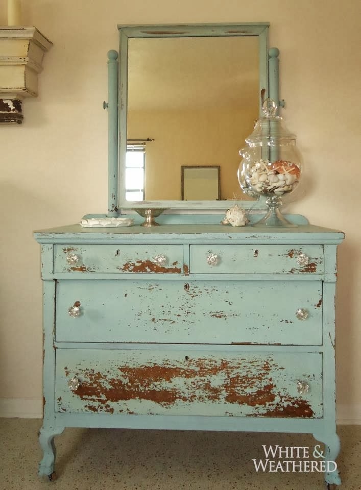
Example #3 - This dresser is a great example from this blogger.  I love the heavy distressing concentrated on the bottom drawer, and the large area on the top left drawer.  Again - not evenly spaced small distressed areas across the entire piece.

http://www.whiteandweathered.com/portfolio/


PROCESS

Before going any further - understand how the two distressing techniques utilized here work.  Both candlewax and Vaseline prevent paint from adhering properly, but the results provide for different looks.

  • Candlewax - creates a weathered and worn look.  The candlewax is applied to a base coat, then painted over with a top coat.  Once the top coat is dry - you can use sandpaper and go over the areas that had candlewax applied - this will remove the top coat and expose some of the base coat.

  • Vaseline - creates a chipped paint look and more easily exposes larger areas of the base coat.  The Vaseline is applied to a base coat, then painted over with a top coat.  Once the top coat is dry - you can use a plastic scraper and sandpaper to go over the areas that had Vaseline applied -this will remove the top coat and expose the base coat.

Here is how I proceeded to create a piece with three layers of exposed paint.

SUPPLIES
  • Sandpaper (to prepare surface) (I typically use 80 grit then 120 grit)
  • Primer (if necessary)
  • Paint (I used latex paint samples from Lowe's)
  • Brush to apply paint,  I use a good quality 2" brush. (Purdy makes good brushes)
  • Old Candle (preferably white or cream colored)
  • Chalk (to mark off large areas to apply Vaseline)
  • Vaseline
  • Medium Sized Artist Brush (to apply Vaseline)
  • Plastic Scraper
  • Old Piece of Sandpaper (80 grit) (for distressing after using candlewax and Vaseline)
  • Cleaning Rag (old T-shirt material works great here)
  • All Purpose Cleaner
  • Satin Polyurethane
  • Foam Brush (to apply polyurethane) Or use the type of brush you prefer
 
PROCESS
  1. Start by lightly sanding the piece and preparing the surface.  You can prime the piece if necessary. If you are exposing the stained finish of a piece - you can obviously skip the priming step.
  2. Apply the base coat color. I did two coats because I wanted to make sure that I did not distress past the blue base coat color.  Let dry.
  3. Use candlewax to prepare for the distressing of edges/corners.  This is as easy as running an old candle along the edge and corners of the piece.
  4. Configure a plan for the chipped paint areas (where the Vaseline will be applied).  Decide where you will have large areas of chipped paint.  I found it useful to mark the table with chalk (outline areas where you want the chipped paint look).  I marked off some large areas and also focused on marking off some select areas of the edges.
  5. Apply the Vaseline to create large "chipped paint" areas.  Keep in mind - wherever you apply the Vaseline the paint will not adhere and will easily scrape off later.  Apply Vaseline in these select areas with a medium sized artist brush.  (I say medium-sized because a tiny brush will take forever to cover the larger areas, and a large brush will make it difficult to cover only the smaller areas you want.)
  6. Paint over the entire table.  Painting over the Vaseline areas is a little disconcerting.  The paint will look "goopy" and you might find yourself wanting to paint over it again and again to try to smooth it out - but DON'T.  This goopy looking paint is your friend - it tells you where the Vaseline is and where you will need to scrape off paint.  Remember, accept the fact that wherever the Vaseline is - the paint will be scraped off and it does not matter that it looks "goopy".  This was very hard for me!
  7. Let the piece dry or let it mostly dry.  First take a plastic scraper and scrape off paint in the areas where the Vaseline was applied.  This should be obvious because of the goopy looking paint. NOTE - I say use a plastic scraper because a metal one might take off more paint than you want and tend to scratch a piece.
  8. Use sandpaper on the edges and Vaseline areas to remove more of the paint.  Your sandpaper will get gooped up with paint and candlewax and Vaseline, so you may want to grab some older pieces that you can just throw away after this process.
  9. Let the piece completely dry.   Clean off the piece using an old t-shirt rag and some all purpose cleaner.  This is necessary to remove any residual residue from the candlewax or particularly the Vaseline.
  10. If you are applying another coat of distressed paint - repeat steps #3-10.
  11. Once finished, you can apply a coat of polyurethane

Here is the final product.   It's not the most perfect paint distressed piece ever, but I think it illustrates the idea of less is more.  To me, what makes this better are the colors I chose, and the larger areas of distressing (as opposed to the many tiny small areas sprinkled all over the table).

END TABLE - CANDLEWAX & VASELINE PAINT DISTRESSED


END TABLE - CANDLEWAX & VASELINE PAINT DISTRESSED

END TABLE - CANDLEWAX & VASELINE PAINT DISTRESSED


Here is the table in its own little vignette in the family room.

Rustic Beach Cottage Decor
 
 
If you are interested in a general overview of some DISTRESSING TECHNIQUES, see my post here which covers the use of SANDPAPER, CANDLEWAX and VASELINE.
 
For more beach cottage posts see my Beach Cottage page.


REUPHOLSTER CHAIR SEATS


How to reupholster chair seats with rounded cornersHow to reupholster chair seats with rounded corners

The original fabric on the dining room chairs for our beach cottage was a tan chenille-type upholstery fabric.  Great for durability, but the dining area needed some color and recovering the chairs seemed like a simple project.  I had a bunch of the yellow cabana stripe fabric I got for $5 a yard.  It was already used for one of the toss pillows on the sofa so this would be a good way to tie the two spaces together in the great room.  I know the color white is probably not a good idea for dining room upholstery, but given the fabric is indoor/outdoor and I could Scotchguard it  - I felt it would work out just fine.  In the end I decided to do a couple chairs in the blue patterned fabric for some variety and to add an interesting pattern to the dining room area.

Chair (Before Picture)

I've reupholstered quite a few chair seats and never had much of a problem.  I found it pretty easy to fold tiny pleats to eliminate any creases or folds on the top of the seat.  Not so on these chairs.  They have very thick padding and rounded corners.  Below shows the method I had used before and it wasn't working here...(the combination of rounded corners and thick padding was going to require something different)...

How to reupholster chair seats

In theory - I thought the above method was going to work just fine.  I tried three different times to create the perfect corners this way - no luck.   Unable to finish off a corner without wrinkles on the top, I had to rethink my approach.  I found some posts online with that gave me some direction but I've included more detail here on what I figured out as I went through the process of reupholstering these eight chairs.

A number of posts were helpful in pointing me in the right direction.  It indicated after the sides are secured, you need to take each edge completely to the end  to create a tight corner, than fold up the excess with one large pleat at the corner.  It sounded simple enough but I found it difficult to keep one side of a corner from interfering with the other and having the final pleat end up lopsided.

Here was one of my errors - I would take one side too far and it didn't leave any room to finish the second side for the corner.  Overall I kept getting lopsided results.  The graphic below shows how NOT to do this...

How to reupholster chair seats with rounded corners - don't do this


Here is the method I figured out.  (I am assuming here that the sides have already been pulled taught and stapled and you are ready to finish off the corners.)  Pay specific attention to where the staples go.  If you follow this process, it will leave enough room to finish off both sides neatly and create a single pleat at the rounded corner.  As the graphic below indicates - imagine a 45 degree line (green line) to guide how far to take the staples on each side. Keep the fabric taught and move from one side towards the rounded - corner.  I found it necessary as I got towards the corner to have the staples closer together.  Progressively slope the staples towards the corner while keeping them on this side of the 45 degree line (leaving enough room to take care of the second side).


How to reupholster chair seats with rounded corners


If done correctly, what you are left with are edges are that are tight all the way to the point where they intersect.  It is here you will have a single excess flap of fabric (see graphic above).  If you did the previous step right - you should not have any wrinkles at the corner.  (See the photo a little further down this post and note below on what to look for.)  If all looks well, grab the whole flap to create a single pleat and pull it in at a 45 degree angle, and secure with a few staples. 

How to reupholster chair seats with rounded corners


NOTE: Watch out for this issue with the corners - if you don't pull the fabric tight all the way to the corner - you can end up with these wrinkles at the corner.  This occurs when you pull the final flap over the corner.  I found myself re-doing several corners when I noticed this, but this one slipped by me... (you can see wrinkles on the back corner of the chair on the photo below).


Wrinkled corner - learn from my mistakes :o)

Here is what my corners looked like.  Just a single pleat with the sides, tight with no wrinkles...
The final result is not perfect, and I'm sure a professional could do better, but this is what I was capable of.  I'm sure with a little more practice and patience they could be finished off with an even cleaner look.

How to reupholster chair seats with rounded corners
 
Beach Cottage Dining Room
 

Beach Cottage Dining Room

Since I completed the chairs, I did some more looking on pinterest for better tutorials.  I found this one which I think would have helped me through my project.  They show detailed photos of each step.  In addition, if you have very thick material - it shows you a method where much of the excess material is trimmed off. (See post here)

For more beach cottage posts see my Beach Cottage page.


Tuesday, March 11, 2014

BARN DOOR WALL ART

 
The barn door is one of my favorite pieces in our beach cottage.  It's a big focal point when you walk in the front door and it fits right in with the rustic style my husband and I are both drawn to.  We think it must have been a loft door given the smaller size.  I was lucky enough to find this on Craig's list and got a great deal on it.  I love that it is a kind of surprise - not necessarily something you would expect to see on the wall of a beach cottage, but the weathered wood feels "beachy" to me.

I did very little to it before hanging it, just a some cleaning up.  I used a wire brush and vacuumed it. I also rinsed it off with a 10% bleach solution.  Last, a light coat of mat spray polyurethane finished it off.

We used a French cleat to attach it to the wall as it was rather heavy - just a 1x8 ripped down the middle at a 45 degree angle.  The top half attached to the door itself and the bottom half attached to the wall.  We also attached a piece of 1x4 to the bottom back of the door so the door would not hang in at an angle.


Here it is in the dining room.  I think the dining room table could use an area rug underneath it, but I'm holding of because of the issues with sand in the beach cottage and making this area harder to clean. Should I go with function over form? Perhaps some light and airy curtains on the windows would soften up the space? Hmmmm.....
 
That back corner wall could use something too, but I already have an idea for that...another project for another day...


For more beach cottage posts see my Beach Cottage page.

BEACHY WOODEN COCA-COLA CRATE


Beachy Wooden Coca-Cola Crate


I have had my eye on the Coca-Cola crates every time I hit an antique store when looking for fun and unique items for our beach cottage.  Once the dining room was put together, I felt like I needed some color on the table.  An antique Coca Cola crate would work just fine.  The only catch was - none of them were the colors I wanted.

So...I hunted down the yuckiest cola crate in my local antique store (something I could justify painting).  I came across a Double Cola crate where a lot of the paint had been rubbed off.  It was very dirty and because of the condition, it was rather cheap - right up my alley.

Old Cola Crate
Before Photo

I cleaned up the crate with a wire brush to get most of the dirt off of it and then vacuumed it.  Then I used a 10% bleach solution with water and scrubbed the crate with a toothbrush.  I rinsed the crate well and let it dry.  Once dry, I sanded the piece to remove what was left of the Double Cola letters.

Next, I chose the paint colors - the darker color for the lettering: Drizzle by Sherwin Williams #6479 and the lighter field color: Tidewater by Sherwin Williams #6477.  I purchased paint samples from Lowe's (latex satin).

Paint Colors - Tidewater and Drizzle by Sherwin Williams

I first applied the darker color Drizzle to the long sides of the crate (where the lettering was going to go).  Just to be sure I had enough contrast between the two colors - I added some black acrylic paint and lightly mixed it together and unevenly applied this - think "dark highlights".  I let this dry before the next step.

I went online and found a good front shot of a vintage Coca-Cola Crate and printed the logo on a piece of paper to the scale of the crate.  This took a couple tries.  The first print out to give me a reference point, and with a little math - a second print out to the exact scale of the crate.  Then I adhered the paper print-out to the side of the crate with temporary adhesive. 

Temporary Spray Adhesive

The idea here was to create a sort of reverse stencil.  I cut around the lettering - tedious but doable with an x-acto knife.  Then I removed the paper from around all the letters leaving the paper lettering intact on the side of the crate. 

I lightly applied the lighter color Tidewater over the top of the darker blue color (Drizzle) and around the paper letters.  I carefully did this with two light coats.  I avoided inadvertently pealing the paper letters off or getting too much paint on the brush and having it bleed underneath the paper.

I let the piece dry a bit before removing the paper letters which had been painted over (I found it easiest to kind of "pick" them off with the x-acto knife).  I let it dry all the way before doing some sanding to distress the crate; sanding around the edges and some select areas where the lettering was on the sides.

My apologies for failing to take photos here of the whole process.  I wasn't completely confident in how this was going to turn out - so I guess that is why I wasn't on top of taking photos.   I already had a back-up plan in mind if it didn't turn out - at the very least - I would end up with an aqua colored painted crate.  Fortunately, I think the end product turned out pretty well.

Beachy Wooden Coca-Cola Crate - sandpaper distressed
 
Beachy Wooden Coca-Cola Crate - sandpaper distressed
 
Beachy Wooden Coca-Cola Crate
 

I have had several people say I should fill the crate with something.  I have thought about seashells - too cliché for a beach cottage?  Maybe some small pieces of driftwood?  Some glass jars/bottles that I can place fresh flowers in?  I want to come up with something truly unique, but nothing noteworthy has come to mind yet.  Anyone got any ideas?

The plan is to apply a mat spray polyurethane to seal everything up.  Currently it's way too cold out to do this, so it's going to have to wait.  Overall I think the dining room is really coming together!

Beachy Wooden Coca-Cola Crate

Wouldn't a surf board look great propped up in the back corner?

If you are interested in a general overview of some DISTRESSING TECHNIQUES, see my post here which covers the use of SANDPAPER, CANDLEWAX and VASELINE.

For more beach cottage posts see my Beach Cottage page.


ADIRONDACK CHAIR PILLOWS WITH TIE

 
Adirondack chair pillows with ties
 
These Adirondack chair pillows appear to be nothing special, but they have an extra feature that I think works great here.  There is a tie on the back so they can stay outside full time without the fear of blowing away.  The chairs are fairly comfortable without them, but these pillows provide a little extra lumbar support.  Aesthetically they add some color and coordinate with the cute sea turtle door mat I found at Bealls Department Store.
 
Sea Turtle Door Mat


The striped fabric is outdoor fabric purchased from fabric.com and the pillows are outdoor pillow inserts purchased from there as well.  I figured I better get the materials appropriate for outside since I wanted to leave them out there all the time.  It helps that they are on a covered porch which limits some exposure to the elements.
Aqua and Green Striped Outdoor Fabric

NOTE:  I am a big fan of fabric.com.  The samples are reasonably priced (only $1.75) and they are large in size.  I also like their "Design Wall" feature where you can look at the photos of fabrics side by side.  They also have quick shipping and great customer service.

The tie was created by sewing a strip of fabric to the back of the pillow fabric before sewing the pillow together.  It's not rocket science, but without the ties we would have to worry about the pillows blowing away.

Adirondack chair pillows with ties
 
Adirondack chair pillows with ties
 
Adirondack chair pillows with ties

The chairs are a "Polywood" material.  They make these things out of 90% post consumer waste!  In addition, they are made in the USA.  We were considering wood chairs, however, with the proximity to the Gulf and the salty air - we were concerned how quickly wood might deteriorate.  After asking around - it seemed Polywood was the way to go.  The price was worth it for durable low maintenance chairs at our beach cottage.  It is also nice that they are on the heavy side (similar to a chair made of wood) so that we don't have to worry about them blowing away in strong winds.  I took our friend's advice and put a coat of car wax on them to make them even easier to clean and resist mildew.  We purchased the two Adirondack chairs, the small table and a porch swing from this website.
 
For more beach cottage posts see my Beach Cottage page.